The graphical user interface is, arguably, the most important part of a smart product. It can enable success or ensure failure for the user’s experience. Whether the user is a doctor, consumer, or engineer, the visual way we interact with our products must instill confidence. Working across industries for over 15 years, 219 Design has a deep knowledge of broadly applicable best practices for developing award winning graphical user interfaces.
- Work Together Across Disciplines
- Understand The Whole User Experience
- Leverage Hardware Simulation
- Isolate Presentation from Logic
- Make Your Data Work
Work Together Across Disciplines
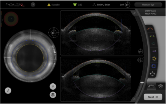
At 219 Design, we develop GUIs that are doctor, engineer, and consumer facing for medical devices, surgical robotics, consumer electronics, and safety products. Most often, the graphical user interfaces we develop are designed to interact with and control physical hardware. We’ve found that working together across disciplines ensures that the whole development team understands how the system and hardware work together. Only with this level of understanding can an interface make sense and works seamlessly with the hardware being developed.
Our software, mechanical, and electrical engineers work side-by-side with UI designers throughout the development process to iterate together and find the best solution quickly. They drive the experience, ultimately influencing the usability and safety of every product they touch. To do this successfully, both the designers and engineers must develop a solid understanding of both how the hardware works and the users’ needs. Because there is no handoff, we can continue to collaborate, communicate, and iterate until completion.
Understand The Whole User Experience
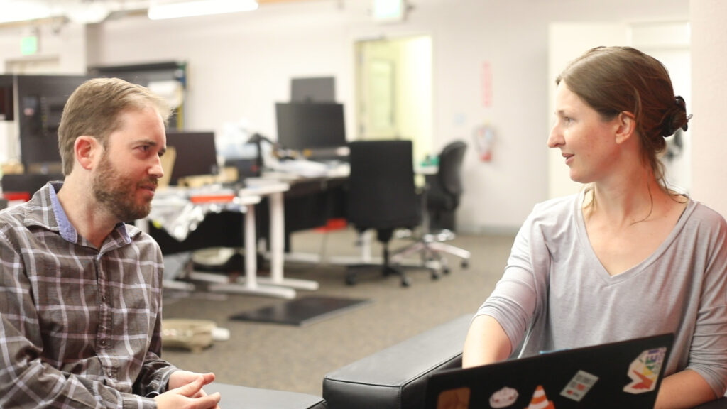
After years of GUI development work, we’ve learned that a user centered design thinking approach goes well beyond knowing who the end users are. To truly understand how the user will need the product to work, observation, interviews, and testing are critical to inform the design. This knowledge empowers our clients to make strategic tradeoffs between things like quality of experience, cost, and development time and drives our engineering decisions. It also enables us to focus on the features that the majority of users need, rather than investing too much time and money to only satisfy a small percentage of use cases.
The User Experience Path: We typically start our development by creating a user experience path. This includes a workflow map for the entire process – both on and off screen. These are the steps that the user will perform in sequence to interact with the product. From that point, we can build prototypes, start testing, and begin the iterative design and development process.
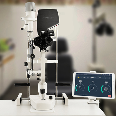
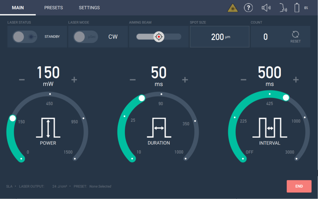
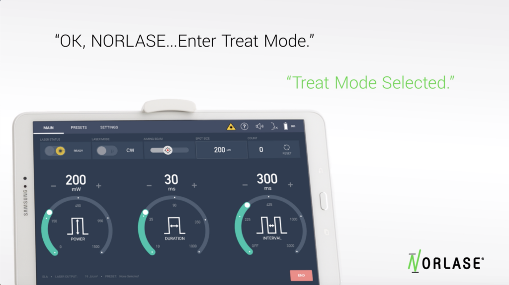
Client Example: We recently developed the graphical user interface for a next generation Laser Photocoagulator. One of the key improvements was identified by observing doctors using the technology available at the time. At one point in the procedure, the doctor is using both hands on the patient and machine. Requiring doctors to adjust the system manually at this point in the procedure was not a great option. Our client, Norlase, made the decision to incorporate voice control to solve this common user pain point. 219 design was able to seamlessly integrate both voice and touch control into the user interface.
Reduce Costs and Increase Quality with Simulation
As a new product is coming to life, the hardware is typically difficult to come by or still under development. Additionally, hardware is expensive. Building a simulator as a stand-in for the hardware is the unsung hero of the development process. It allows the software team to make significant progress with limited access to the hardware. In many cases, the simulator that 219 Design uses for development gets “promoted” to help the UI designers get feedback from real users or even to help the marketing team run demos for prospective customers. Even if the simulator is only used by the development team, the benefits far outweigh the costs.
Benefits for Developing a Simulator to Stand in for the Hardware
- Save Time: Having a simulator allows the software team to test the software earlier and in relative isolation as opposed to wasting time waiting on hardware and then spend time debugging the software and hardware simultaneously. A simulator also reduces time spent integrating the software with the hardware. Differences in behavior uncovered during integration can be resolved by updating the simulator to match the hardware behavior (or fixed in the next board spin if the hardware isn’t behaving the way it’s supposed to).
- Lower Costs: Including a simulator early in the development process helps drive the software architecture to be more maintainable in the long run. Designing for simulation implies that there is a clear separation between the “front-end” software and the “back-end” firmware and hardware. This abstraction limits the parts of the system that need to change when requirements change, lowering overall development cost.
- Fix Bugs Faster: Finding a way to reproduce bugs is often the biggest impediment to fixing them. A simulator allows developers to easily reproduce bugs in their preferred development environment. If the bug cannot be reproduced with the simulator, then the hardware must behave differently from the simulator, which generally indicates the developers have made an assumption about the hardware that turned out not to be true, which is likely the source of the bug.
When developing software for a product, developing a simulator reduces overall costs, reduces development and debugging time, and contributes to a well-architected software system. Combined, these benefits lead to a higher quality product.
Isolate Presentation from Logic
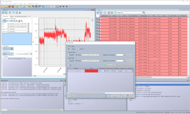
Within the front-end software, there are limitless ways to design and implement the graphical user interface. Just as with the interface to the hardware, one tried and true rule of thumb is to separate the visual representation of the GUI from the internal logic of the system. When business logic is intermixed with visual representation, you often need to use slower tests that involve drawing the GUI, or even reach for an expensive commercial GUI testing tool. By separating out the visual representation, standard developer tests generally suffice for testing the logic of the application, and the views can be viewed and updated independently of the application.
Model-View-Controller for Visual Representation: We commonly use the Model-View-Controller (MVC) family of architectural patterns to achieve this separation. The specific architecture tends to be different depending on the technologies that the product uses, but some architecture derived from MVC is always a good choice to implement a maintainable, testable system. Modern GUI frameworks such as Qt handle all of the user input for us, so the MVC architecture as it was originally conceived is not strictly necessary. Instead, we adapt to the specific implementation technologies using a derivative architecture, such as Model-View-ViewModel when using The Qt Company’s QML language, or Passive View when using more traditional widgets frameworks.
Make Your Data Work
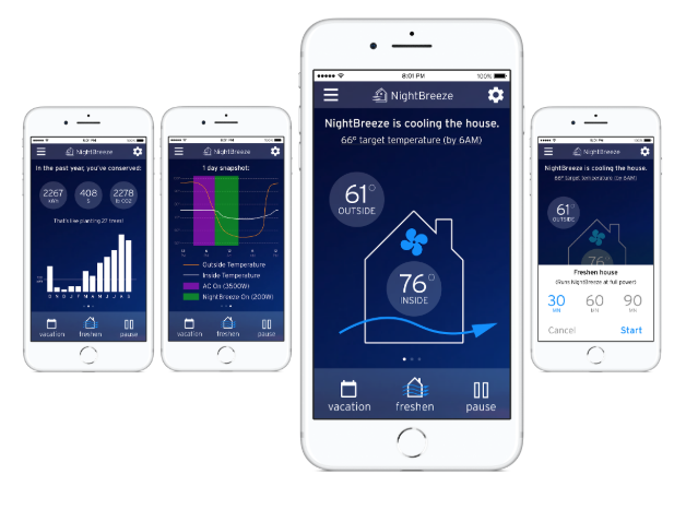
I like to tell newcomers to GUI development that all software is the same. Take data from here and put it there. The biggest design challenge with GUI development is figuring out what data to show at what time and where to show it. Obviously implementing the visual layer is critical for a successful GUI program, but the underlying infrastructure is just as important to achieving a well-performing program. As such, we touch much more than the graphical layer when we design and implement a “GUI.”
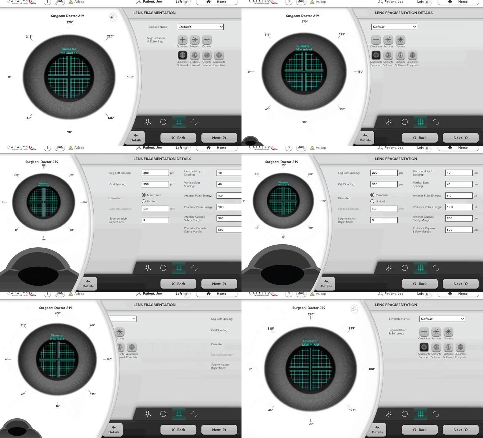
Balancing Visible and Hidden Data: There are two complementary concerns with data in a GUI: display and storage. At 219, we have successfully designed GUIs that strike the right balance between data displayed and data hidden. A product is always intended to do a particular task, and the hardware has many implementation details that are necessary for the task, but are not interesting to the user. A good GUI limits the amount of information on the screen to the data necessary for the task at hand. It also presents the data in an easy-to-consume way, using a mix of text, graphics, animation, and color to create an intuitive experience.
Finally, Get Help When You Need It
Your company is great at doing what you do. When you want to do something new, there’s no harm in reaching out to a firm with different experience and expertise.
If you find that you could use some additional skills, knowledge, resources, or perspective – contact 219 Design. Our value goes beyond expert product development. We’re in the business of helping our clients achieve success. Our approach, our passion, and our versatility show in our results. With 219 Design, you get a true development partner that is in it for the long run.
Awards
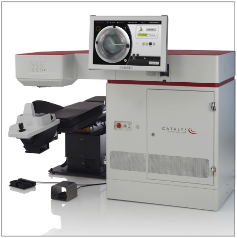
OptiMedica’s Catalys™ Precision Laser System – R&D 100 Award Winner
Norlase Leaf Green Laser Photocoagulator – Spark Award Finalist
